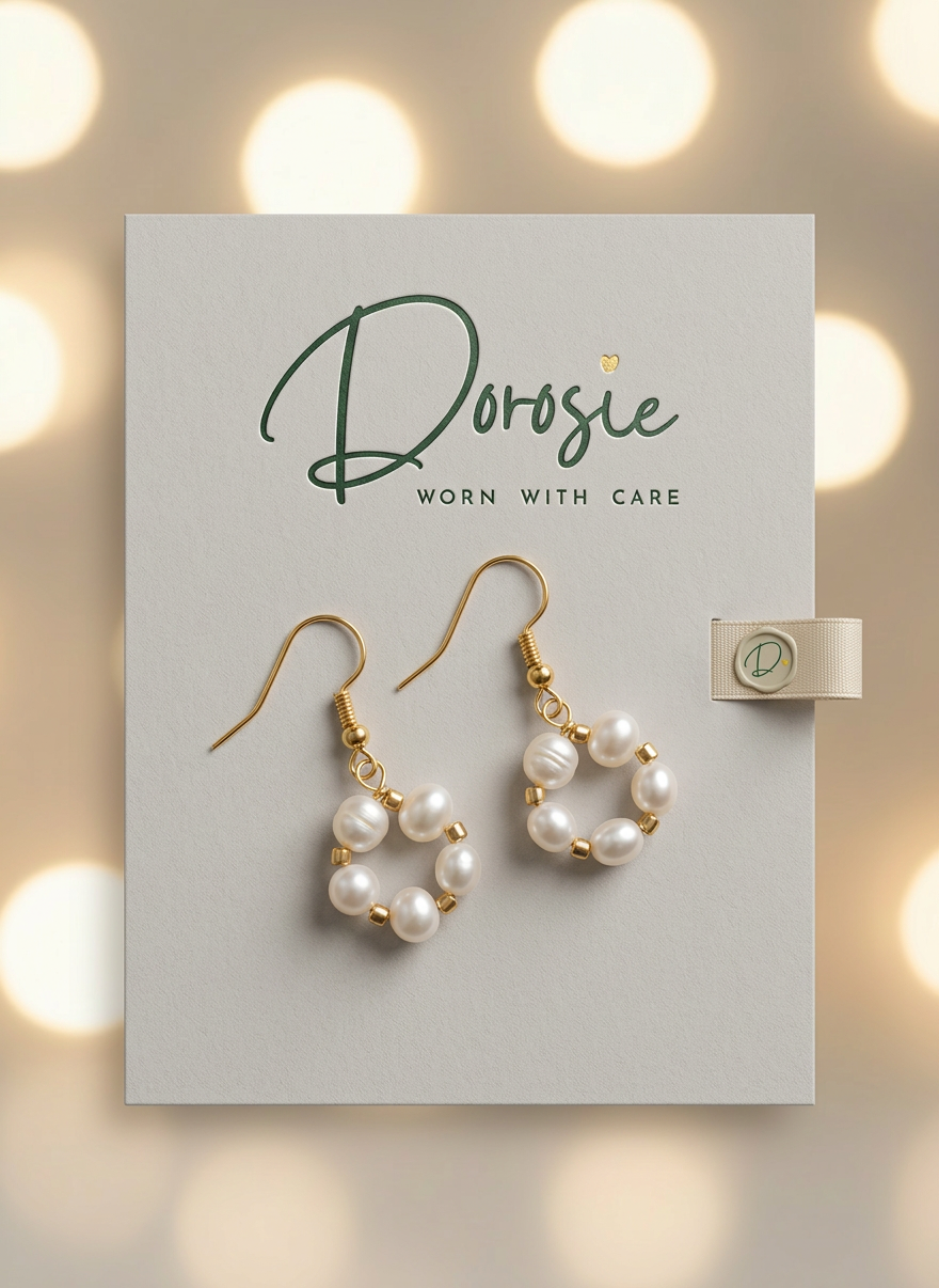
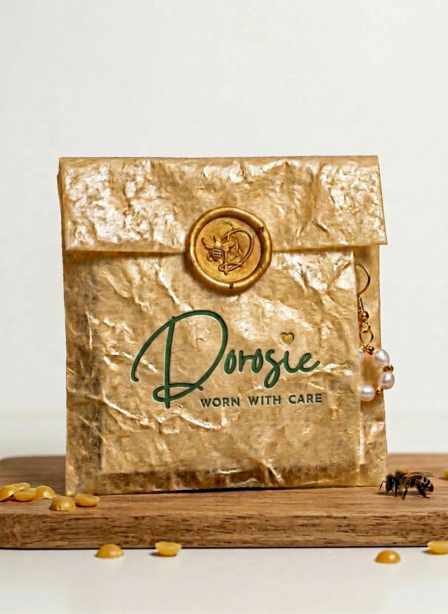
Dorosie Jewellery Logo Design
Overview: This logo design focused on creating a distinct visual identity for my personal jewellery brand, Dorosie. The goal was to translate the brand’s core values—tranquility, comfort, and groundedness—into a recognizable mark. I developed a custom visual system that captures a "calm, cozy, and comfy" atmosphere, positioning the brand as an earthy and approachable alternative to traditional luxury jewelry.
Role: Brand Identity Designer & Logo Designer
Concept: "Nature’s Gentle Embrace"
The concept is rooted in the organic beauty of the natural world. By utilizing soft, muted green tones and fluid lines, the design represents the "moss-covered" stillness found in nature. The identity seeks to evoke a sense of warmth and peace, creating an emotional connection between the wearer and the grounded essence of the brand.
Problem / Challenge: The primary challenge was to strike a perfect balance between "handmade warmth" and "professional quality." A logo that is too organic can look amateur, while one that is too clean can feel cold. I had to carefully refine the hand-drawn curves and weight of the lettering to ensure it felt soft and welcoming, yet remained legible and sophisticated enough to represent a high-quality jewellery line.
Solution: I developed a hand-drawn lettering style to ensure the brand felt human and artisanal rather than industrial. The choice of Moss Green as the primary brand color serves as a visual anchor, reinforcing the brand's earthy identity. I balanced the organic typography with a minimalist layout, creating a versatile logo that maintains its "comfy" character across various scales—from tiny jewelry tags to digital platforms and packaging.
Tools: Adobe Illustrator (Vectorizing & Typography), Adobe Photoshop (Texture & Mockups)