Typographic Poster Design:
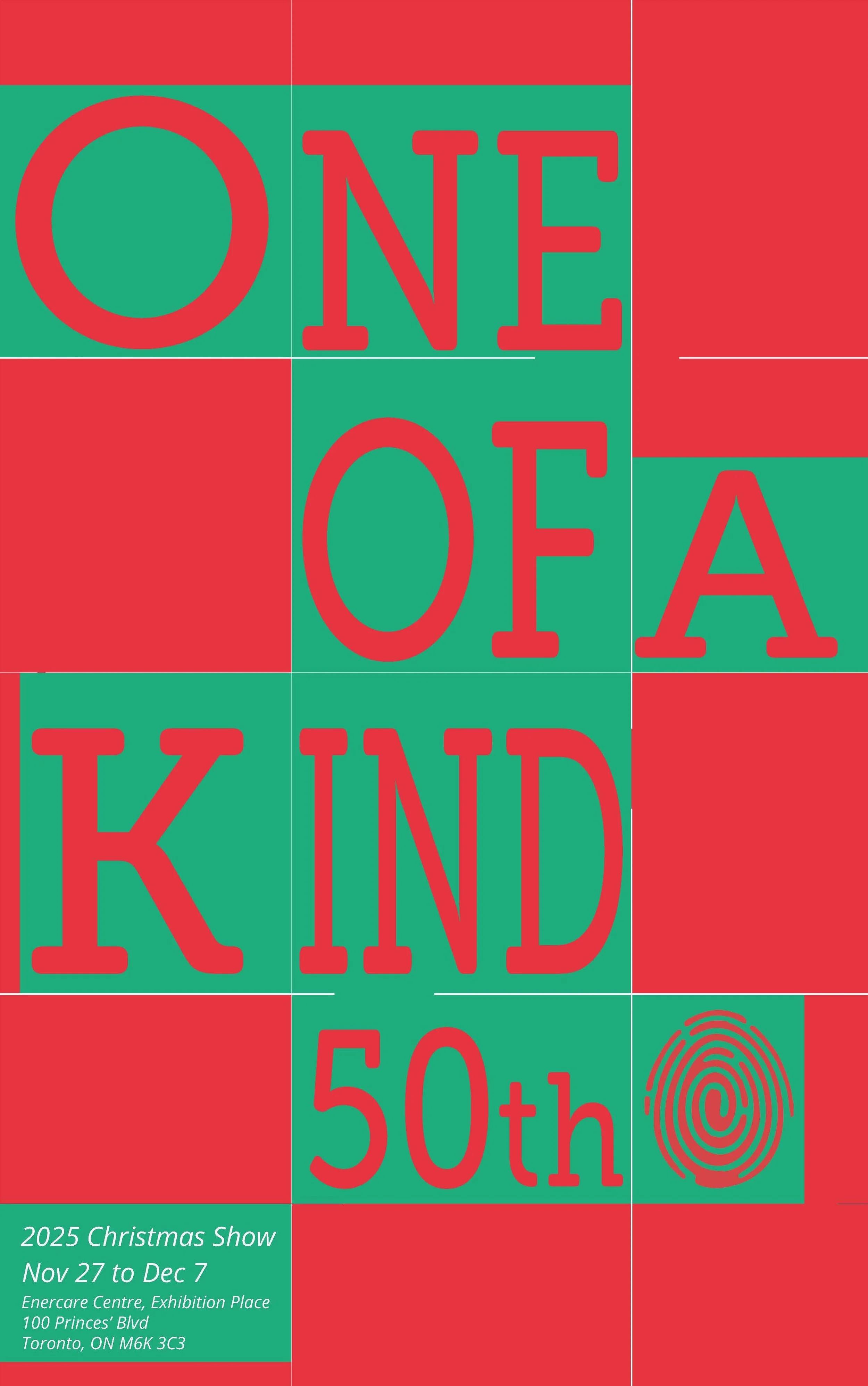
One of a Kind
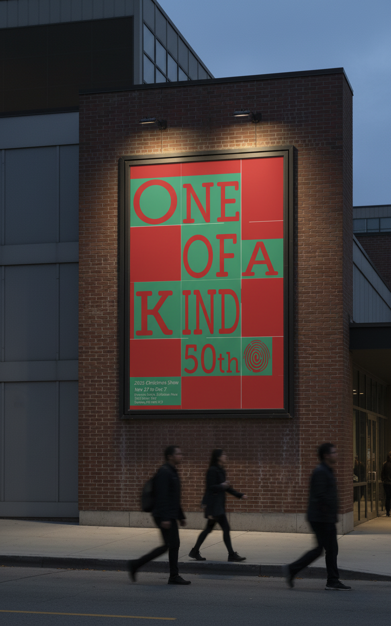
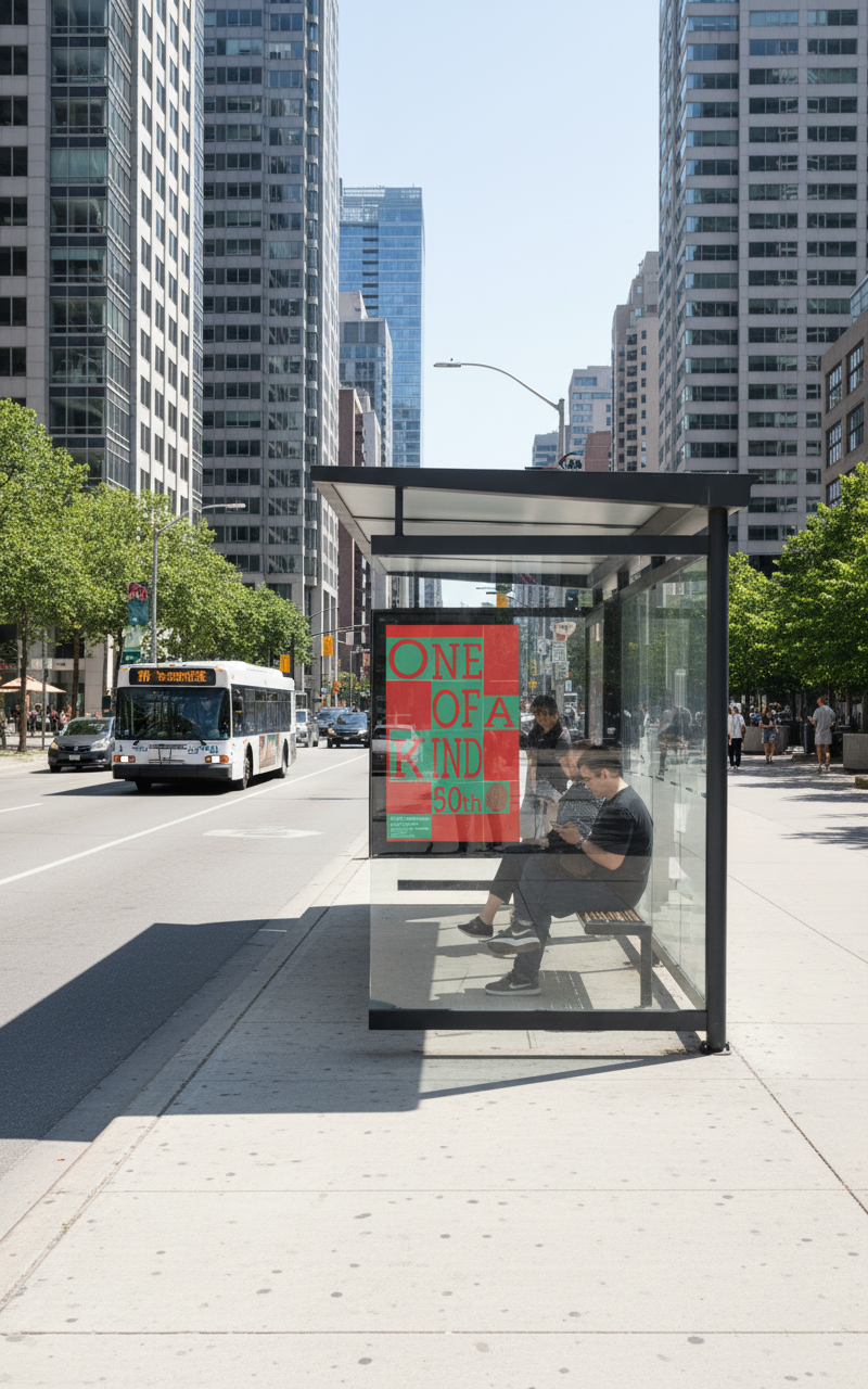
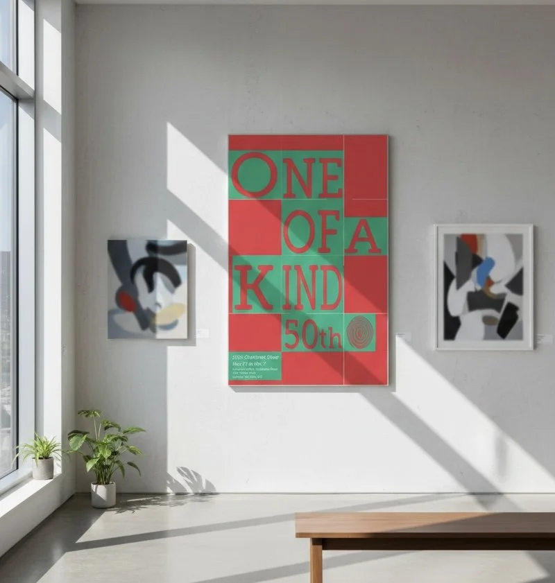
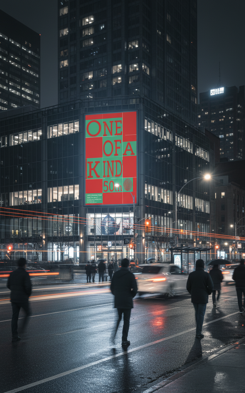
Overview: This project involved designing a promotional poster for Toronto’s "One of a Kind" show, focusing on a holiday-themed edition. The objective was to communicate the festive spirit of Christmas and the artisanal nature of the event using only typography and color, intentionally excluding any representational imagery or photography.
Role: Graphic Designer (*school project)
Concept: "Festive Structure"
The concept explores the intersection of holiday warmth and systematic design. By using a checkerboard grid as the foundation, the design seeks to mirror the organized yet vibrant atmosphere of a curated craft show, using rhythmic type placement to evoke the energy of the season.
Problem / Challenge: The primary challenge was to evoke a clear, recognizable "holiday feeling" without falling into the clichés of traditional imagery (like trees or stars). Relying solely on type meant that the hierarchy and rhythm had to be perfect to maintain viewer engagement. Through an iterative feedback process with peers and mentors, I had to solve the problem of visual "flatness" by manipulating the scale and placement of text to create depth and a lively, festive energy within a static grid.
Solution: I utilized a bold, high-contrast palette of red and green to instantly trigger a "Christmas vibe." The layout is built upon a rigid grid system, where each character and word is meticulously placed to create a sense of visual balance and movement. This structured approach allows the typography to function as both information and a decorative pattern, resulting in a clean, modern aesthetic that stands out in an urban environment.
Tools: Adobe Illustrator (Grid development and Type setting), Adobe InDesign (Layout refinement), and Print Production Specs.