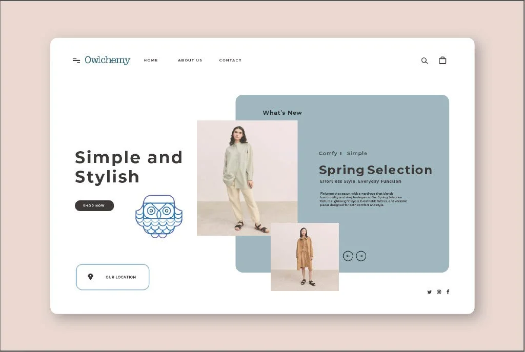
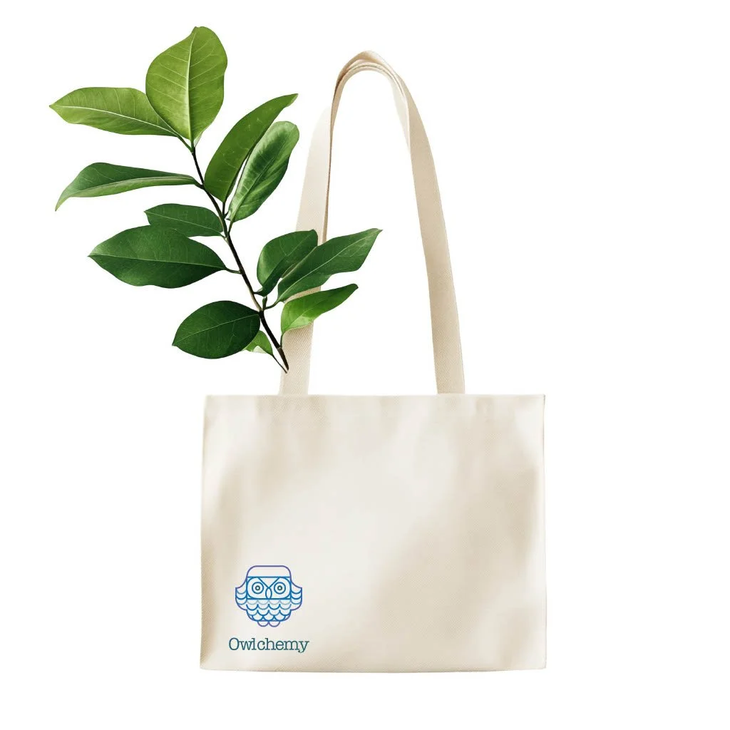
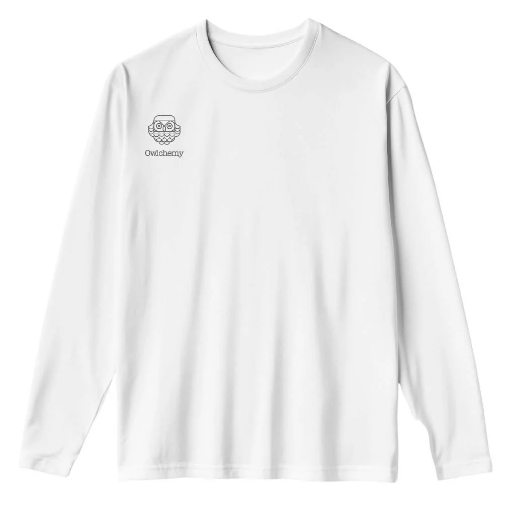
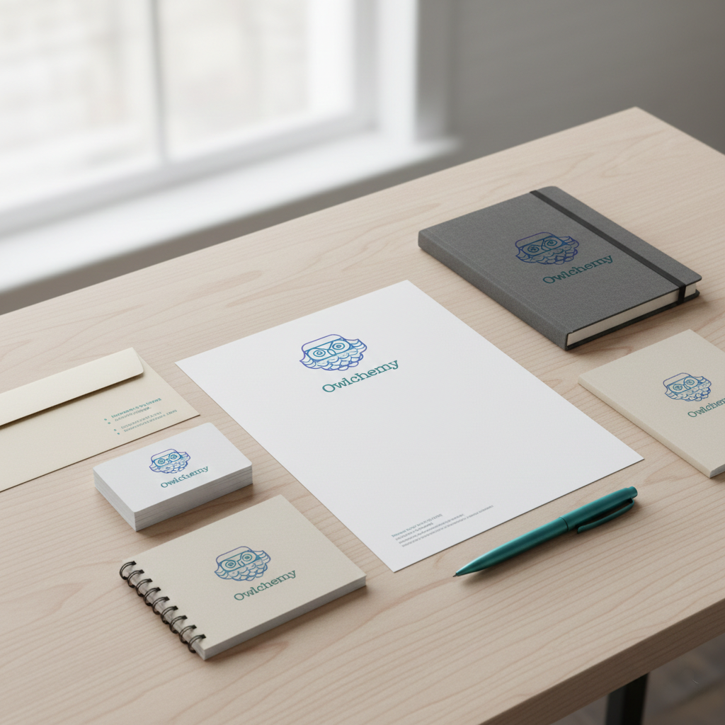
Quadradius Logo Design
Overview: This project is a logo design created during my second semester as part of a foundational design assignment.
It focuses on building a logo from scratch using a structured grid system, specifically the quadradius grid. Through research, iteration, and feedback, I developed a clean and balanced logo that reflects both precision and visual harmony.
Role: Graphic Designer
Concept: The concept is based on structure, balance, and geometric clarity. Using the quadradius grid as a foundation, the logo explores how simple geometric forms can be combined to create a visually cohesive and recognizable mark.
Problem / Challenge: As my first logo design project, the main challenge was creating a strong visual identity from scratch while strictly following the constraints of the quadradius grid. Balancing creativity with technical precision was difficult, and I initially struggled with proportion, alignment, and consistency.
Solution: I approached the problem through research, iteration, and continuous feedback by:
Studying existing logo systems and grid-based designs
Experimenting with multiple variations using the quadradius structure
Refining alignment, spacing, and proportions based on critique
Through this process, I achieved a well-balanced and structured logo that demonstrates both conceptual clarity and technical execution.
Tools: Adobe Illustrator